In film, style and presentation function as communication tools. They are not decorative choices but methods of conveying character, mood, and credibility within seconds. Before a single word of dialogue is spoken, audiences have already formed judgments based on what they see. The visual elements of a film—costumes, sets, lighting, and color—work together to anchor perceptions and guide interpretation.
This principle extends beyond the screen. Industry professionals, from directors pitching projects to actors walking into auditions, face the same reality: first impressions form quickly and tend to persist. Understanding how visual communication works in film provides insight into why presentation matters at every level of the industry.
How First Impressions Form
The opening moments of any film carry significant weight. Trailers and the first few minutes of a movie act as a “cold open,” designed to capture attention and establish expectations. A well-executed opening creates what some call a “halo effect,” where viewers carry their positive initial response forward, interpreting subsequent scenes more favorably.
This happens because audiences make rapid assessments based on limited information. Once those assessments are formed, they become anchors that influence how all subsequent information is processed. A film that looks polished and intentional in its opening frames signals competence and care. A film that appears careless does the opposite.
The same mechanism operates in professional settings. Before a person speaks, others are already forming impressions based on posture, expression, and appearance. A screenwriter walking into a pitch meeting communicates something through every visual detail—from clothing choices to accessories like Maxwell Scott leather attaché cases. These nonverbal cues function the same way a character’s wardrobe does on screen: they convey professionalism, attention to detail, and personal standards without a single word. In both contexts, audiences quickly reach conclusions and hold onto them.
Using Costume Design to Communicate Character
Costume design serves a narrative function. The clothing a character wears conveys background, personality, and social status before any dialogue occurs.
Consider the difference between a character in a well-worn jacket and one in a tailored suit. The first suggests a history of physical labor or limited resources; the second signals power or professional success. These are not subtle cues. Audiences process them instantly and use them to categorize characters and predict behavior.
Costume designers make deliberate choices about:
- Color: Darker tones often suggest seriousness or villainy, while lighter colors may indicate innocence or vulnerability.
- Texture: Rough fabrics convey different information than smooth, expensive materials.
- Fit: Ill-fitting clothes can suggest discomfort or lower status; perfectly tailored garments suggest control and resources.
- Era and style: Period-accurate costumes establish setting, while anachronistic choices can signal rebellion or outsider status.
These elements work together to tell audiences who a character is before the plot reveals it through action.
Using Production Design to Establish Atmosphere
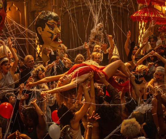
Production design—the sets, props, lighting, and physical environment of a scene—shapes how audiences experience a film’s world. This aspect of filmmaking, sometimes called mise-en-scène, determines whether a space feels lived-in or sterile, welcoming or threatening.
A minimalist set with harsh lighting suggests a different genre and mood than a cluttered room with warm lamplight. Horror films often use confined spaces and shadows to create a sense of claustrophobia and unease. Science fiction frequently employs clean lines and synthetic materials to suggest technological advancement or alienation.
Props contribute to this effect. Objects in a scene are rarely accidental. A character’s desk covered in papers communicates different information than an empty desk with a single laptop. These details build a sense of reality and help audiences understand the world they are entering.
Production design also establishes genre expectations within seconds. Audiences recognize the visual language of different film types and adjust their expectations accordingly. Meeting those expectations builds trust; violating them without purpose creates confusion.
Using Color Palettes to Signal Emotion
Color grading—the process of adjusting colors in post-production—acts as a psychological cue throughout a film. Different color temperatures and saturations trigger different emotional responses.
Cool blue-gray tones often establish feelings of alienation, sadness, or suspense. Warm colors—oranges, yellows, and reds—tend to suggest passion, nostalgia, or comfort. These associations are not arbitrary; they reflect patterns in how humans respond to light and color.
Filmmakers use color palettes to:
- Differentiate between time periods or locations within a single story.
- Signal shifts in a character’s emotional state.
- Create visual continuity across scenes.
- Guide audience attention to specific elements within a frame
A consistent visual style throughout a film conveys intentionality. It signals that the creators understand their craft and have made deliberate choices. Inconsistent color work, by contrast, can make a film feel disjointed or amateurish.
Key Takeaways
First impressions form quickly and persist. In film, this means the opening scenes set the tone for everything that follows. In professional settings, it means the first moments of an interaction shape how all subsequent communication is received.





Leave a reply